Thursday, 4 November 2010

magazine prices-research


Comparison of music magazine prices

Music magazine name
Price
Weekly/monthly
NME
£2.20
Weekly
Q
£3.99
Monthly
Kerrang
£2.20
Weekly
Top of the Pops
£2.20
Monthly
Clash
£3.80
Monthly
Mojo
£4.50
Monthly
Classic fm
£4.60
Monthly
Rock sound
£3.90
Monthly
Uncut
£4.20
Monthly
Drummer
£3.95
Monthly
The Word
£4.50
Monthly
Maverick
£3.50
Monthly


Monday, 1 November 2010

Magazine front cover annotation

Different music magazines

Magazine
publisher
Target audience
Kerrang
Bauer
20+
Classic rock
Future publishing
40+
Mojo
Bauer
20+
NME
IPC
20+
Q
Bauer
Young adults+
Top of the pops
Bauer
Teenagers


Magazine
Publisher
Target audience
Classic fm
Haymarket
Older audience
Classical music
Rhinegold publishing
Older audience


Amount of music magazines on sale in the U.K

On this website-http://www.world-newspapers.com/music.html I found a list of music magazines along with categories however it does not state what country they are from so some could be from places like America and not all in the U.K making it difficult to know exactly how many music magazines are on sale in the U.K.

magazine elements

The elements that the magazines have in common are that they all use a main focus image, which is of a solo music artist or a band, which is conventionally expected on a music magazine as this relates the genre and one of the main parts of the particular issue. They also use this selected artist/band, as they are the main focus of the magazine. All the magazines have their name aligned to the top and this is either to the left or central. The fonts used are very bold and are layered on top of the main picture on the front cover; they are also easy to read in order to attract attention. They also include a barcode, which is conventionally expected on a magazine. The most important contents of the magazine are also displayed on the front cover in order to provide a preview and to sell the magazine with the main articles. The colours mainly used are also primary colours, which makes the front cover appear very bold. The font used also represents the music genre for example on the ‘Kerrang’ front cover with the main text. They all use a nameplate in that the logo is combined with the company name which is a convention on music magazines. The magazines also use teasers in that they contain artwork and headlines on the front page in order to make people buy the magazine, this is conventionally expected as it is a marketing technique.

Sunday, 31 October 2010

preliminary task-magazine front cover and contents page plan

 This is my plan for my magazine front cover.
This is my plan for my magazine contents page.

Monday, 25 October 2010

Preliminary task evaluation

AS Preliminary task evaluation


Successfulness of the front cover:

My final front cover was fairly successful as it was similar to how I had designed it in my flat plan and contained images gathered from the photographs I took as well as a main portrait image, however there are elements of the front cover that need improving.

Aspects of the cover that need alteration:

The front cover needs alteration to the portrait image as it needs to cover a larger span of the front cover. There also could be more information on the front cover in relation to the contents of the magazine. I would also like to alter the background by making it more complex instead of using a plain colour on the background.

Similarity to the flat plan and improvements in the effectiveness of the planning stage:

The front cover is similar to the flat plan in that the layout is nearly the same and alterations from the flat plan were used in order to improve the front cover for example the readability of the front cover was not as good when all the text was on a slant on the left hand side.

The planning stage effectiveness could be improved by testing ideas on the computer first before starting the final design to make sure the layout is effective and that the design works and in this stage ideas can then be improved for example font, colour and sizing changes.

Strength of the contents page plan/ finished product:

My contents page plan is reflective of the final contents page as they look similar therefore the contents page plan was quite strong, however adding more details onto the contents page plan would have enabled the final contents page to be created more effectively.

The finished version of the contents page was a strong design as it looked as effective as the front cover if not more effective and I think this was due to understanding how to use the InDesign program and its tools and features.

Practical skills that I have developed during the work in the preliminary task:

The practical skills that I have developed during this task is how to use the program InDesign which I hadn’t used previously which meant that I learnt a lot of the skills of the program such as placing objects into the document and formatting the object to fill frame proportionally and fit content proportionally as well as adding effects such as drop shadow in order to enhance images and to make my front cover and contents page more effective.

Key lessons that need to be carried into the main task:

The key lessons that need to be taken forward into the main task are that planning needs to be effective in creating the finished deign and testing the planned design beforehand could do this. I will also take forward my skills of using the program InDesign that I hadn’t used before and now know how to use it in order to create a magazine front cover and contents page.

Preliminary task

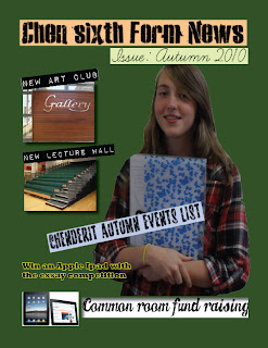
This is the front cover of the magazine which I created for the preliminary task. The prelininary task was to create the front cover and contents page for a new school magazine.


This is the second part of my preliminary task which is to cretae a contents page for the school magazine.